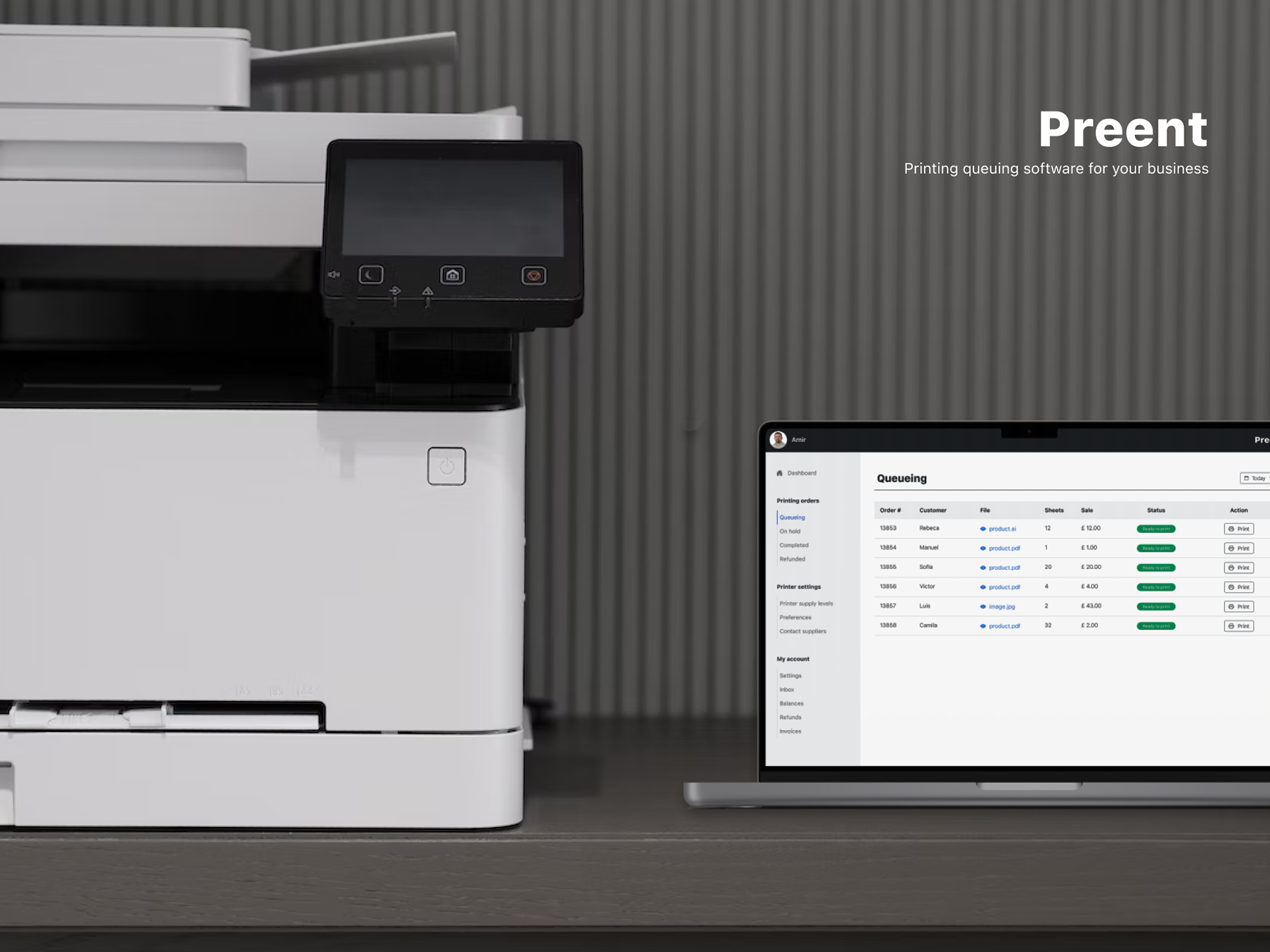
Preent is a printing queuing software for print shops.
My role in this project was to interpret the research data given, and from there, I continued with the typical design process, from defining user flows to prototyping. I did it all by myself. However, I did have some mentoring and feedback during the process from other designers that helped me shape the final design.
Problem Statement
A print shop receives many printing requests every day and struggles to manage the printing workflow. All the tasks are performed manually by only 1 operator. This is causing delayed orders, wasted resources, and unhappy customers.
“How might a simple and easy-to-use interface automate the print shop’s workflow tasks, help them save on supply costs, and improve their performance and user satisfaction?”
Solution
Preent is software that maximises the printing shop's performance by helping them schedule print jobs efficiently, save on supply costs, optimise operator efficiency, and increase user satisfaction. Print shops can easily integrate this desktop version into their existing software and avoid additional investments.
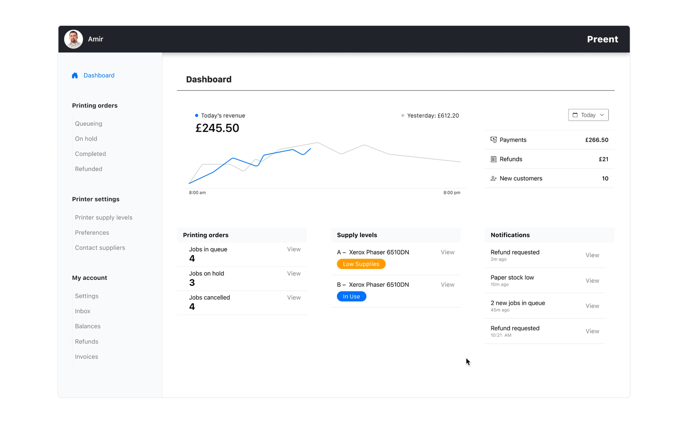
How does it work?
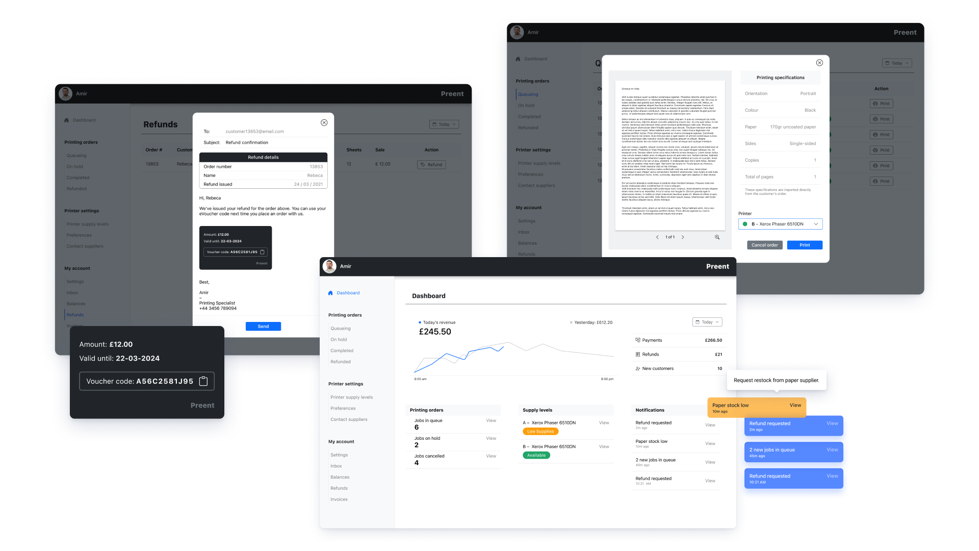
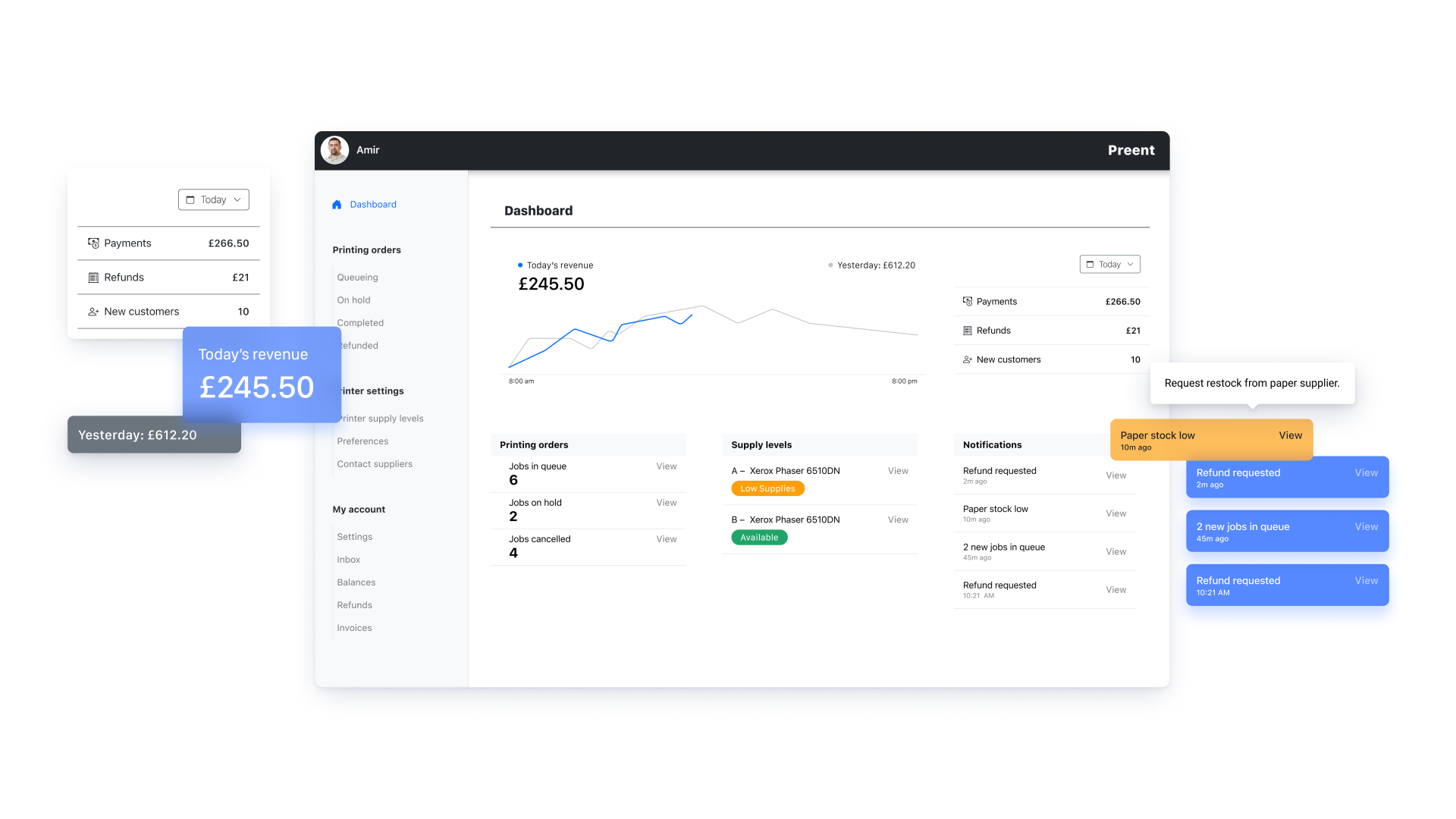
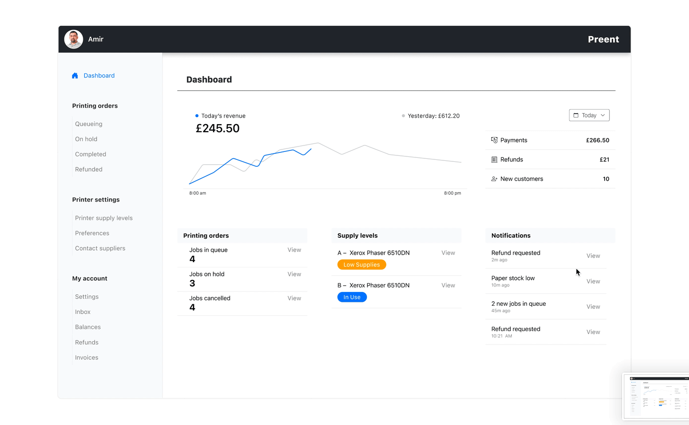
The dashboard displays only essential info to guide Amir to achieve the main goal, which is to complete orders successfully. I selected 4 different scenarios the user might face while trying to achieve this goal. These scenarios are shown below:
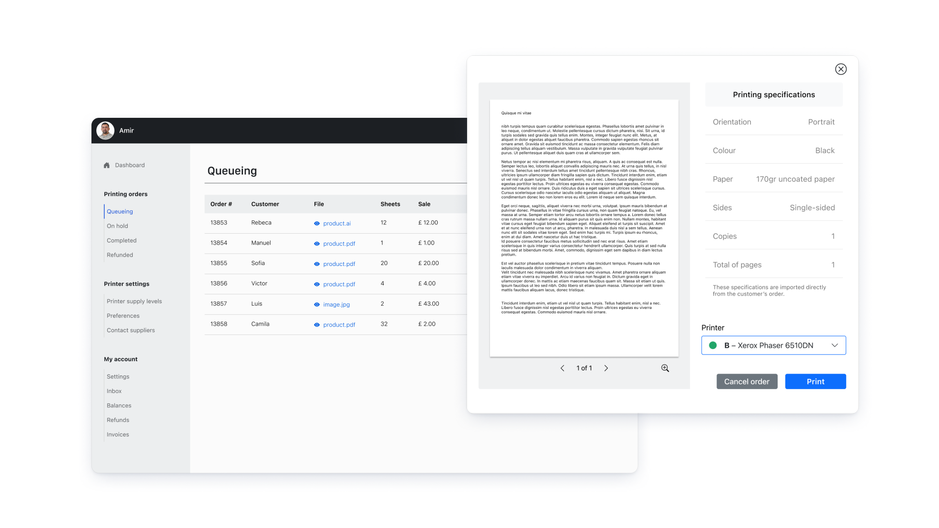
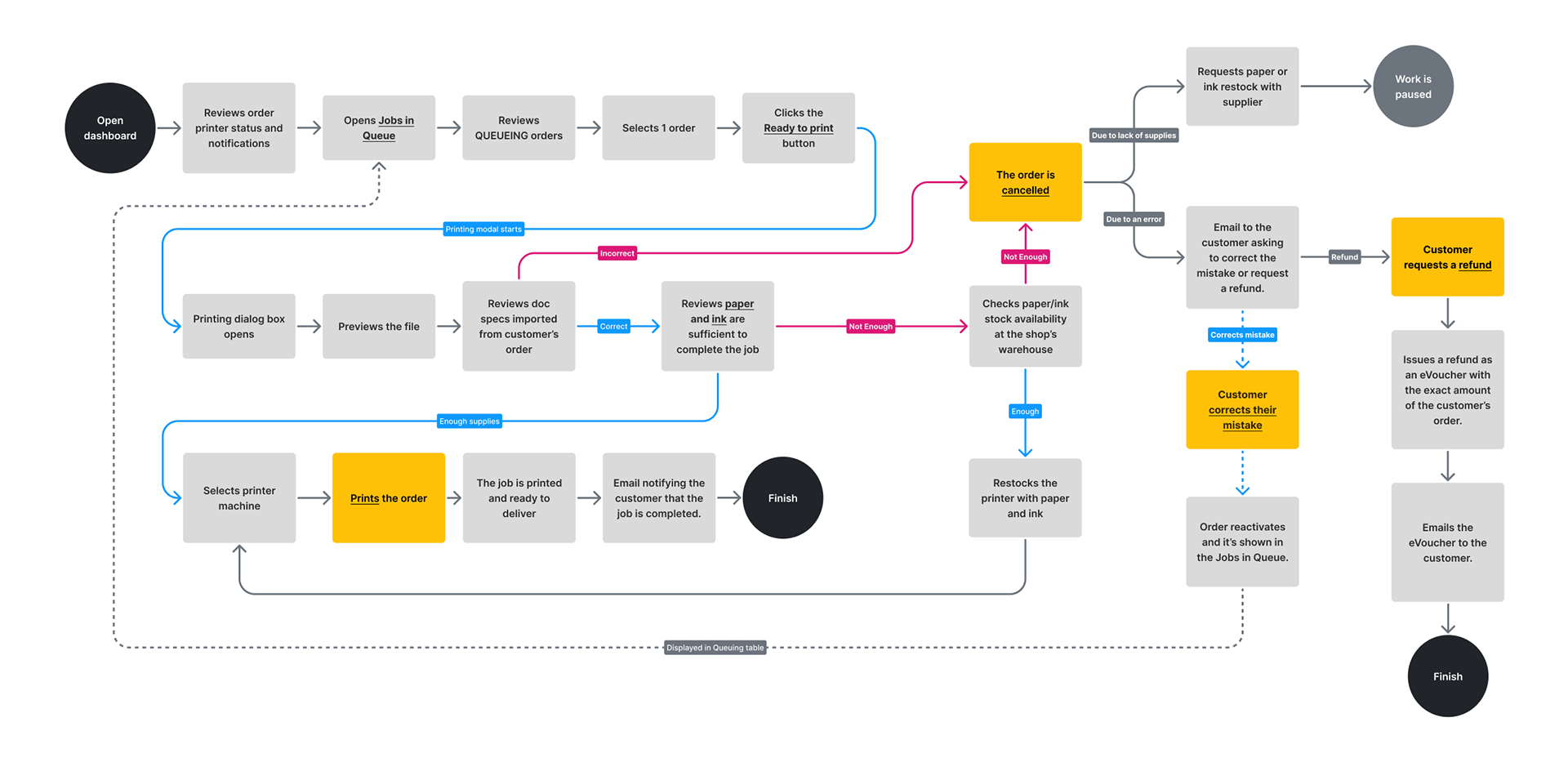
1. Printing successfully or cancelling an order
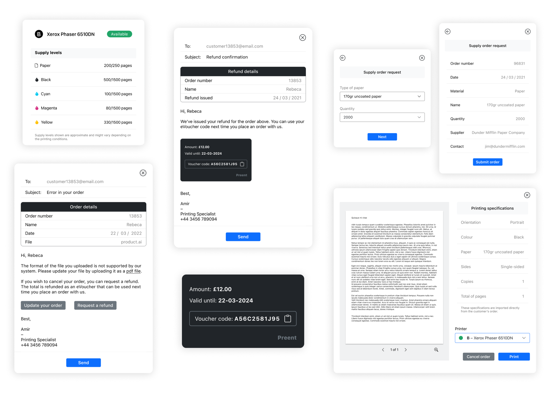
After reviewing the pending jobs, the user can preview the files before printing. From the same window, he can send it to print or detect any error, cancel the order and notify the customer. Customers can then correct their order mistake or ask for a refund.

2. Issuing a refund
After receiving a refund request notification, the user can issue the refund as an eVoucher and share it with the customer by email. Customers can use it the next time they place an order.
3. Ordering restocking of supplies
Status labels and notifications alert the user when supplies are low. He can order a restock within the same screen, select the quantity and the type of materials, and send the order to his supplier by email.
Design decisions
☞ Wow, you've made it this far!
Keep reading if you're interested in learning more about my design approach and thought process for solving this challenge. I will explain each step in detail.
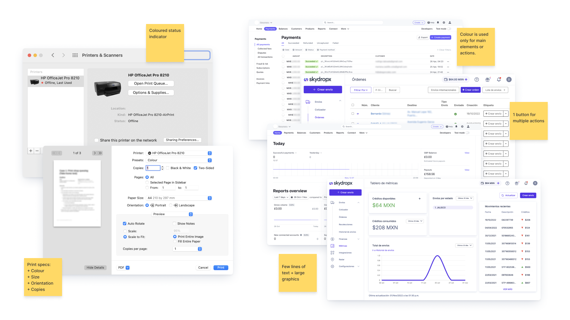
1. Market analysis
I first studied my software's printing modal to learn how it works and identify the essential elements to be included in the design. Next, I analysed Skydropx and Stripe dashboards because they follow a similar UI approach to what I was looking for. I scanned the visual design, the ease of navigation and the interaction.
2. Understanding the user
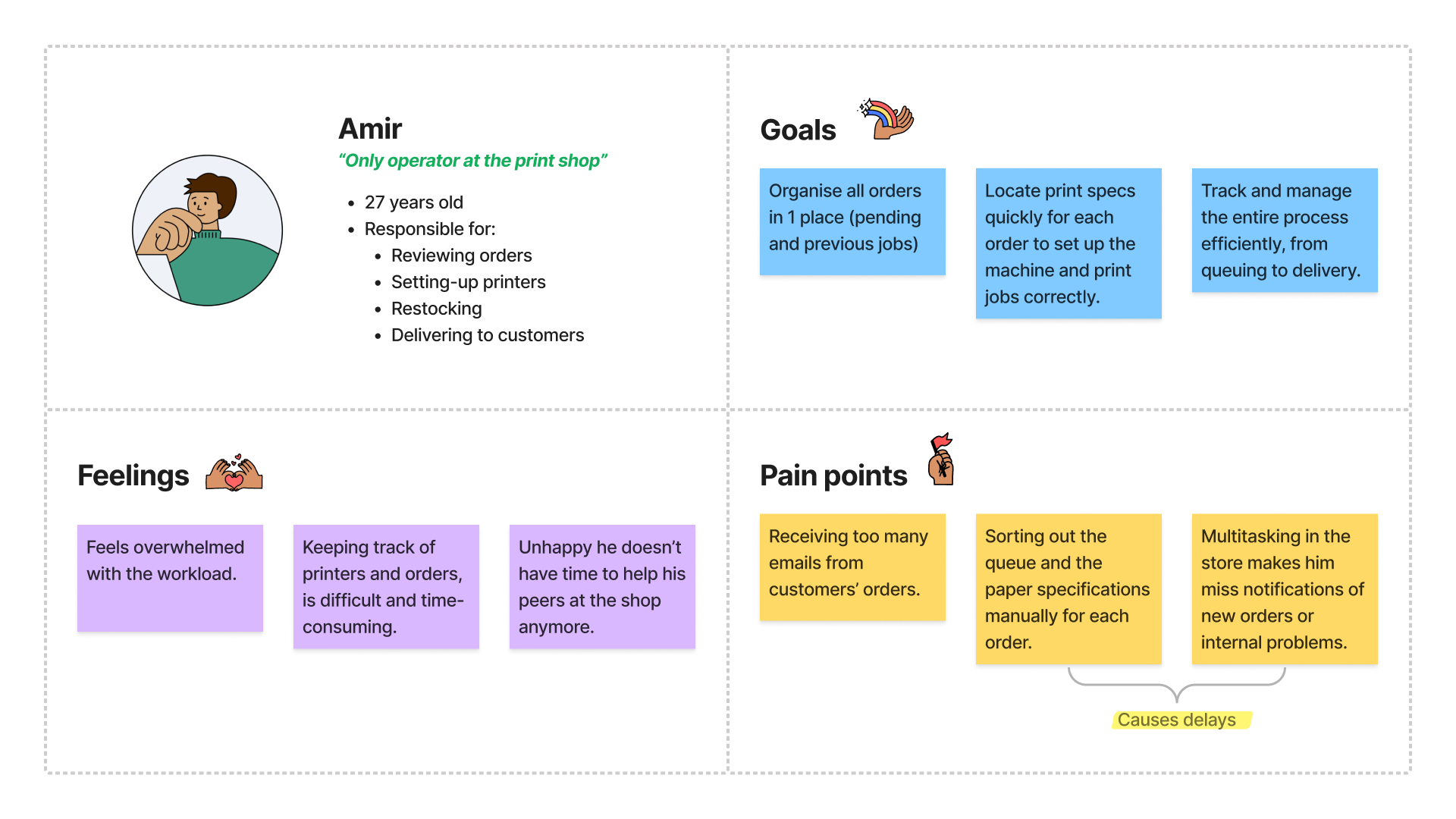
The user persona was given in the design challenge.
3. Design requirements
Based on previous research, I concluded that the interface should have:
1. Clean, simple and easy-to-follow UI – Have key information always visible and accessible to the user.
2. Familiar layout – Avoid cognitive overload and help the user master the interface faster.
3. Paid then queue – Show only paid orders with an attached file and print specifications in the print queue.
4. Clear previews – Allow the user to preview a file before printing it to avoid waste of resources.
5. Second chances – Notify customers when their order has been cancelled, and encourage them to correct the error or request a refund.
4. Assumptions
Problem and user data were given in the design challenge. However, I had to make some assumptions to fulfil this challenge, such as:
* The print shop’s internet network works properly.
* The software integrates a payment processor that provides customers with instant and secure transactions (payments and refunds).
* The user continuously monitors the availability of paper and ink stock in the store, replenishing constantly with the supplier.
5. User flows
The main goal is to complete orders successfully. To achieve this goal, the user might face 4 different scenarios: print a document successfully, cancel an order, issue a refund, and request a supply restock with a supplier.
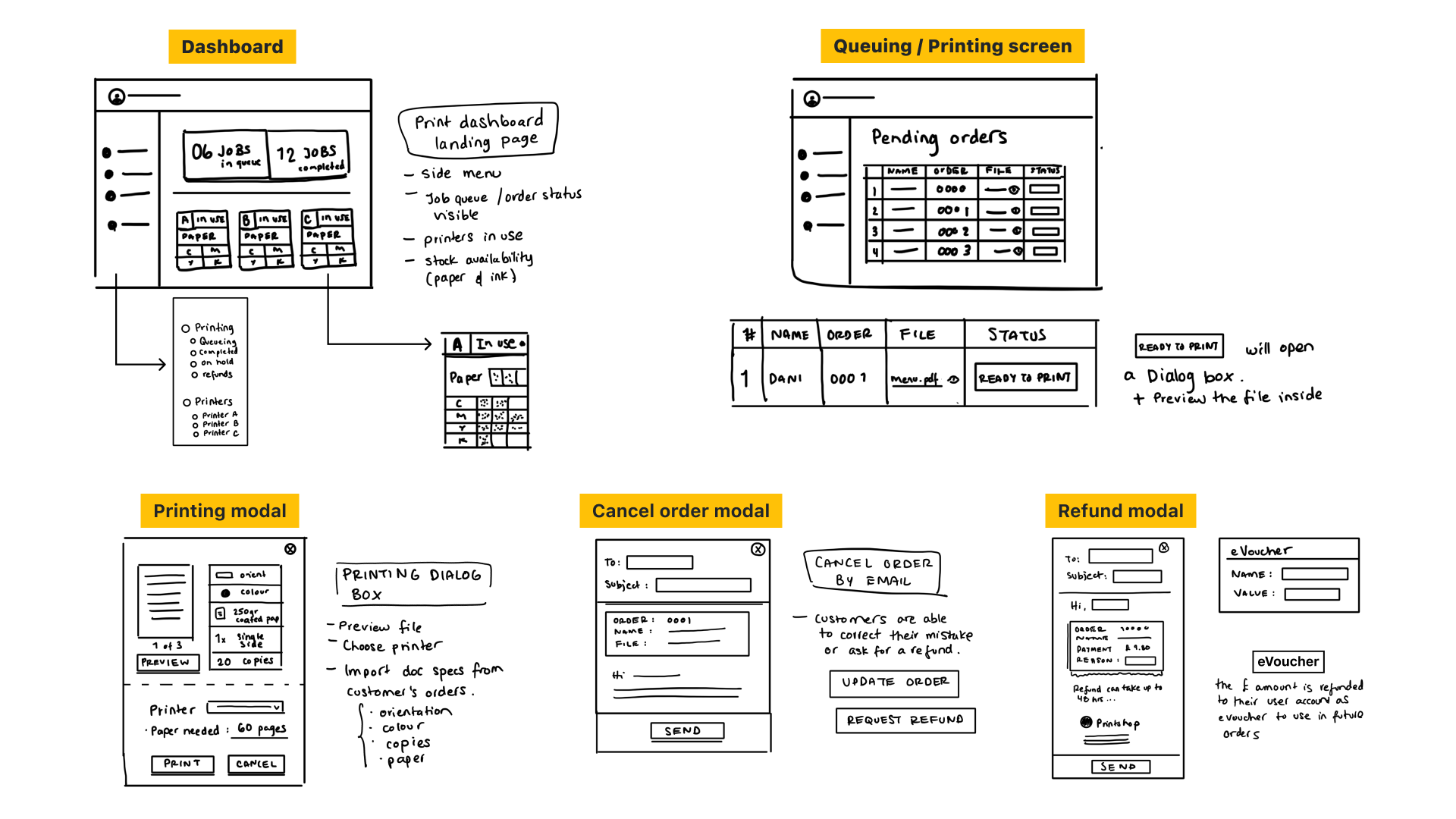
6. Wireframes
I started working on the wireframes next. I sketched some ideas for the dashboard and printing queue screen. Additionally, I added some modals to understand better specific user interactions.
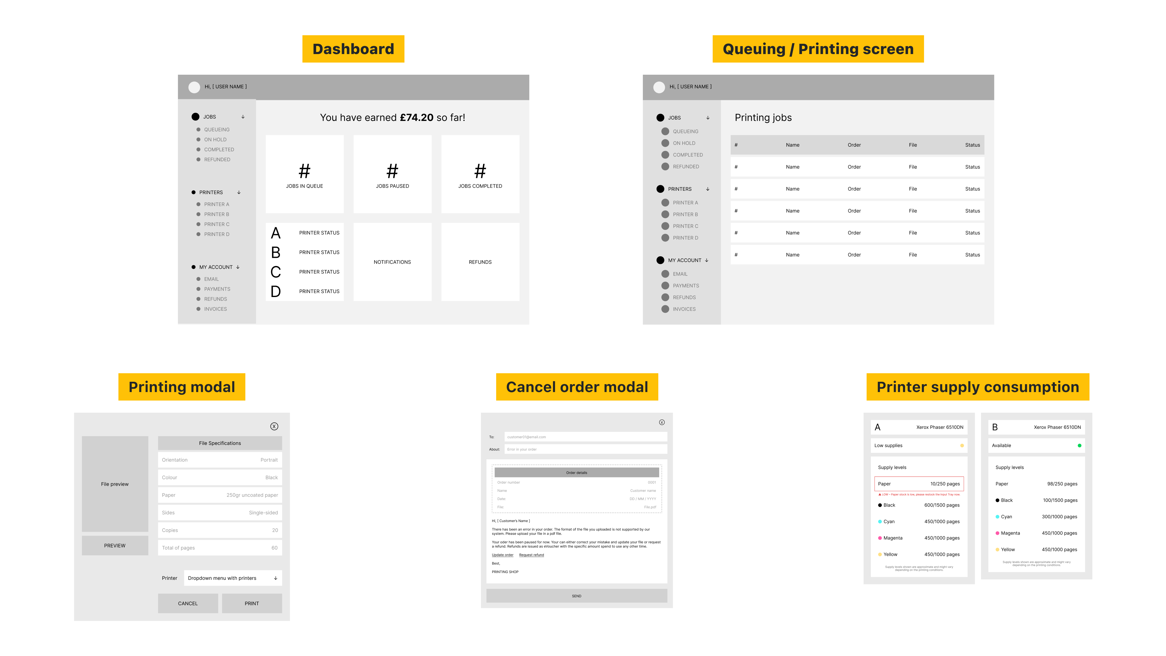
In Figma, I focused on designing the main screens and the most essential elements of my user flow. From there, I received feedback from another designer and continued to refine each of the screens with those insights for the final prototype.
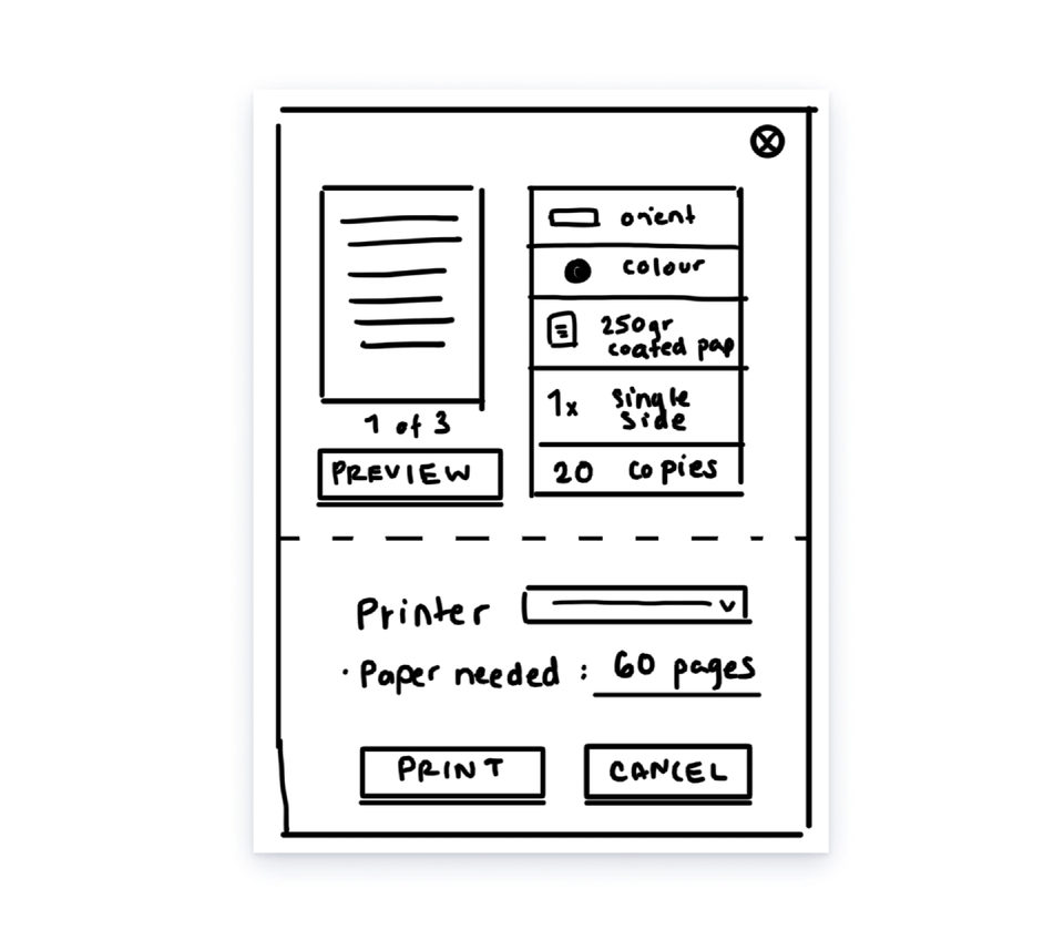
Printing dialog box evolution
The print dialog box evolved several times in the process to improve the user experience. I reduced unnecessary actions for the user, such as clicking an additional button to enlarge the file. The final design allows previewing the file in half the dialog box.
7. Visual Design
Using the market analysis as a benchmark and my design requirements, I used Bootstrap 5 Design System for all UI elements like icons, buttons, typeface (SF Pro Text) and colours.
To reduce cognitive overload and overstimulation of the user, I decided the UI should have a clean light palette, limiting the use of bright colours only for CTA or labels. The interface should be simple with a familiar and easy-to-follow layout.
Key takeaways:
Since this was a challenge, I missed the chance to get involved in the initial research and the testing and validation with real users. So I had to make some assumptions during this process to complete the task in the given timeframe. I've thoroughly enjoyed my learning journey, but I know there are plenty of things that can be improved and considered, such as:
→ Test the usability of the interface with real users.
→ Work with developers to know the feasibility of this solution and create a minimum viable product for testing.
→ Consider other scenarios leading to new user task flows and features.
→ Work with developers to know the feasibility of this solution and create a minimum viable product for testing.
→ Consider other scenarios leading to new user task flows and features.