Project date: 2020
About: Umi is an observatory of technological development that attempts to explore and promote technology-based solutions, focused on satisfying the essential needs and problems of Mexican society.
Brief
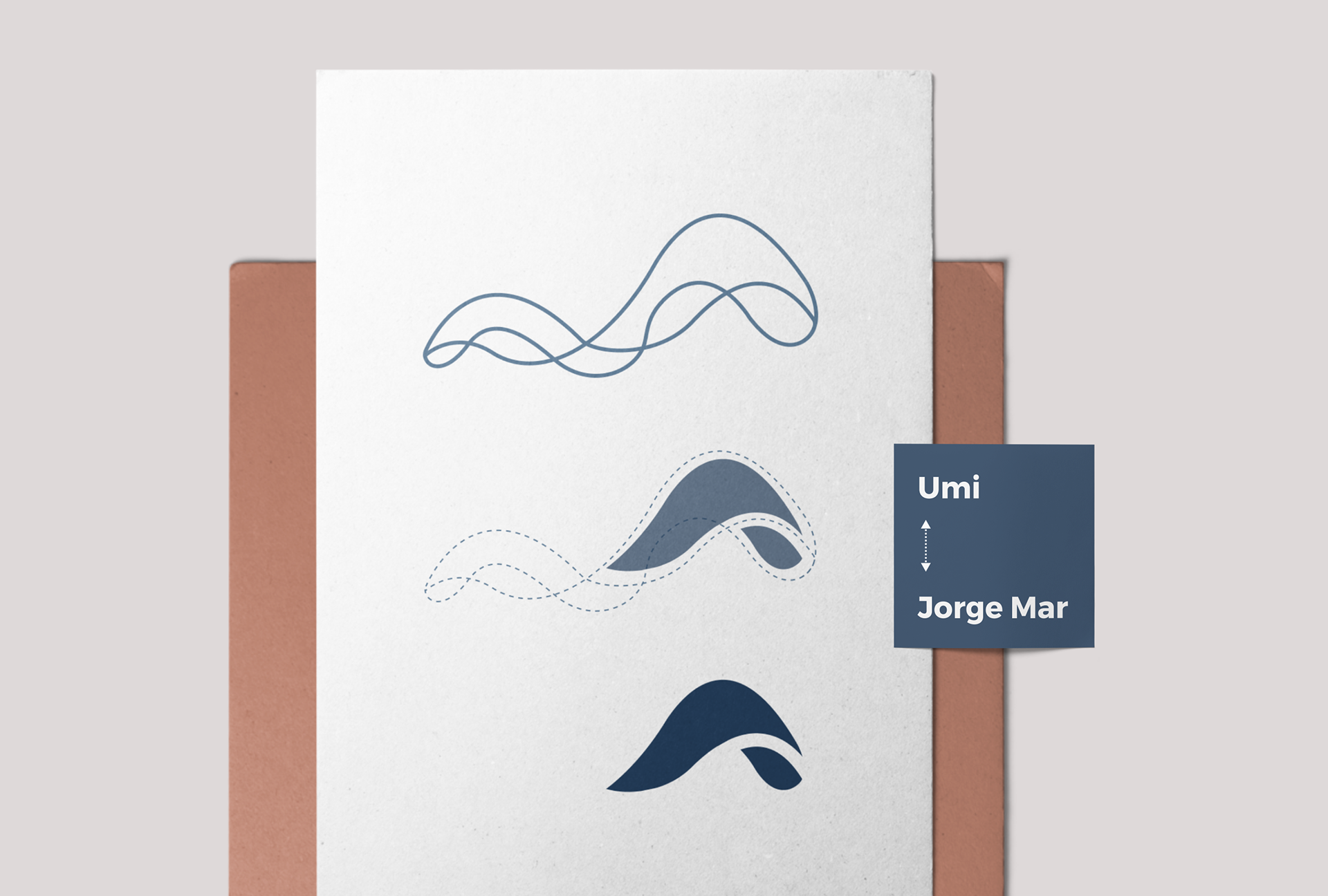
Create a brand identity for the company (Umi) and the founder. My goal was to merge both logos into one complementary, completely independent brand identity.
Brand identity
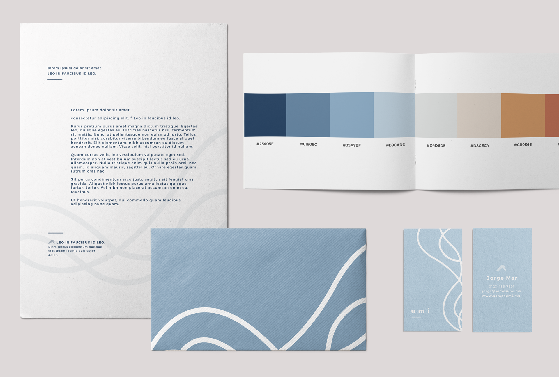
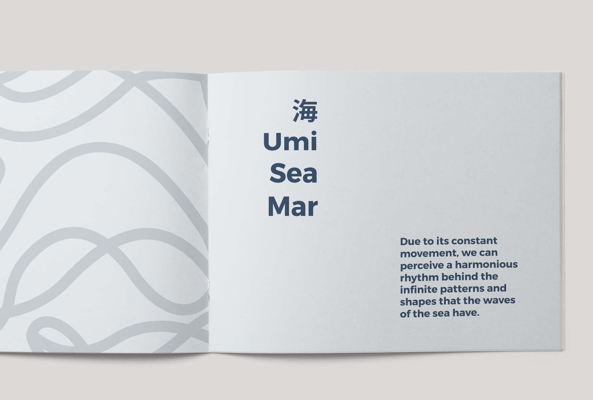
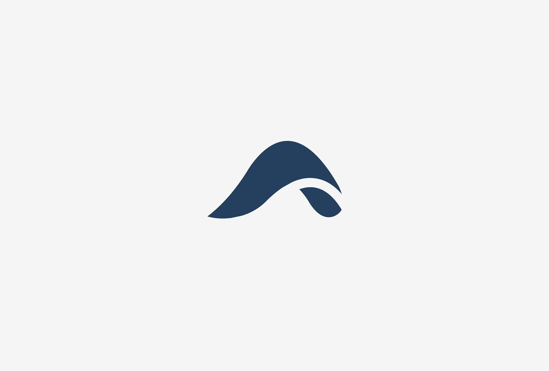
Umi comes from the Japanese language and means sea. The concept of the sea is at the core of the brand. The logo portrays the versatility of the sea by changing its shape and intensity according to the surroundings, just as Umi's commitment to finding solutions to the ever-changing needs of Mexican society. I chose a monoline style for Umi's logo to represent this fluidity and versatility.

The founder logo originates from the core of the company logo, symbolising his participation in the company without compromising his identity.
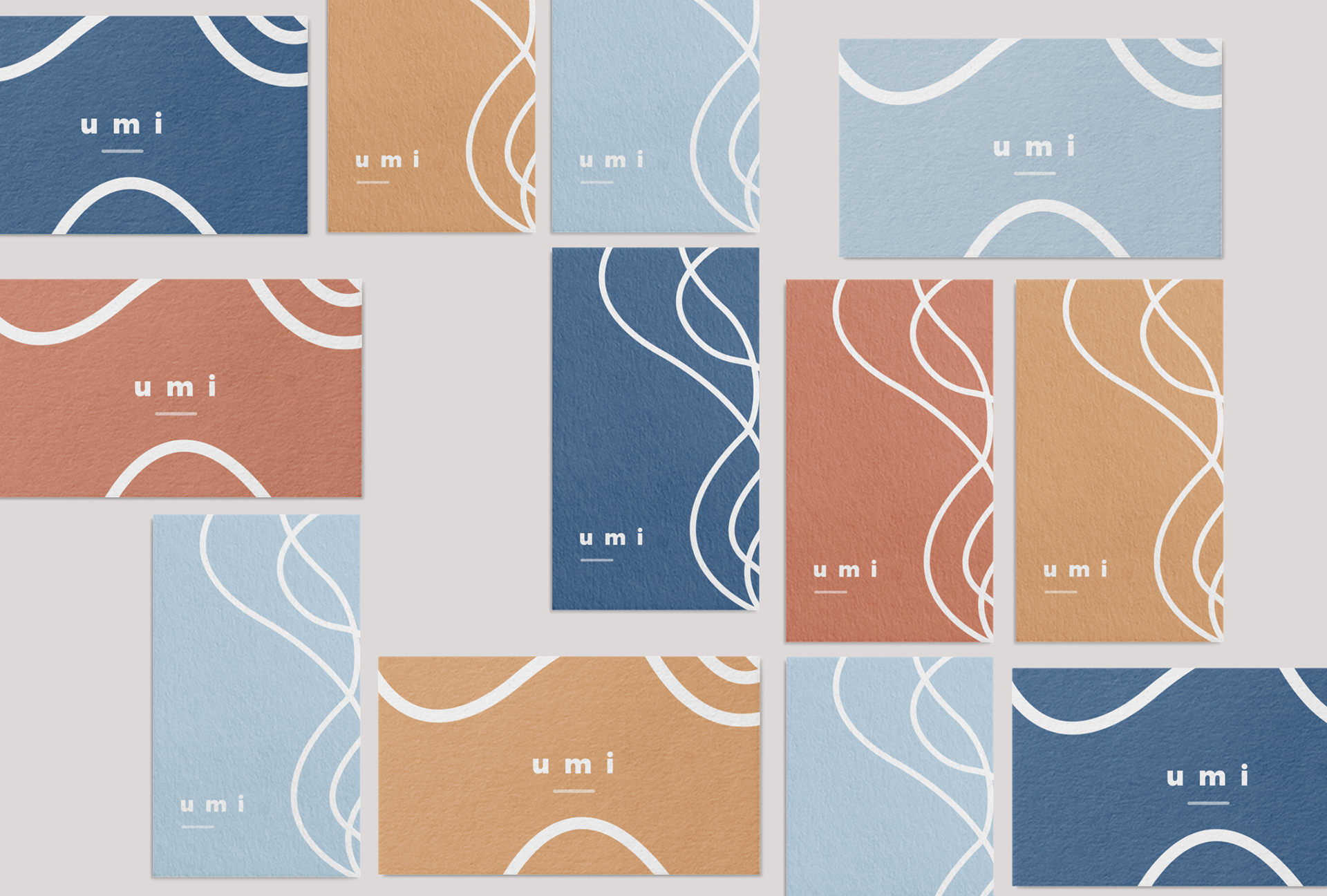
It was a project where I worked closely with the founder. I wanted to capture the essence of his young and innovative personality through the project's proposals, colour palette, and business stationery.